BLK INK Realty
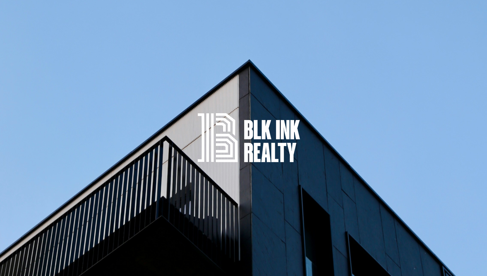
Logo Design
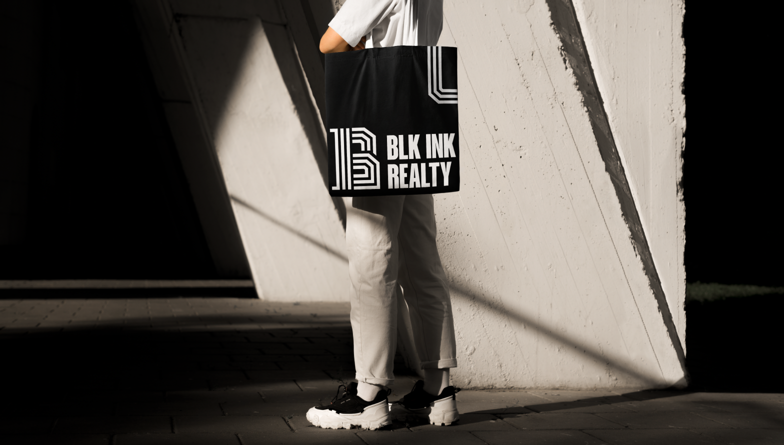
Visual Brand Design
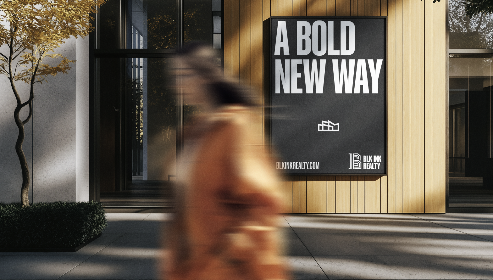
Signage Design
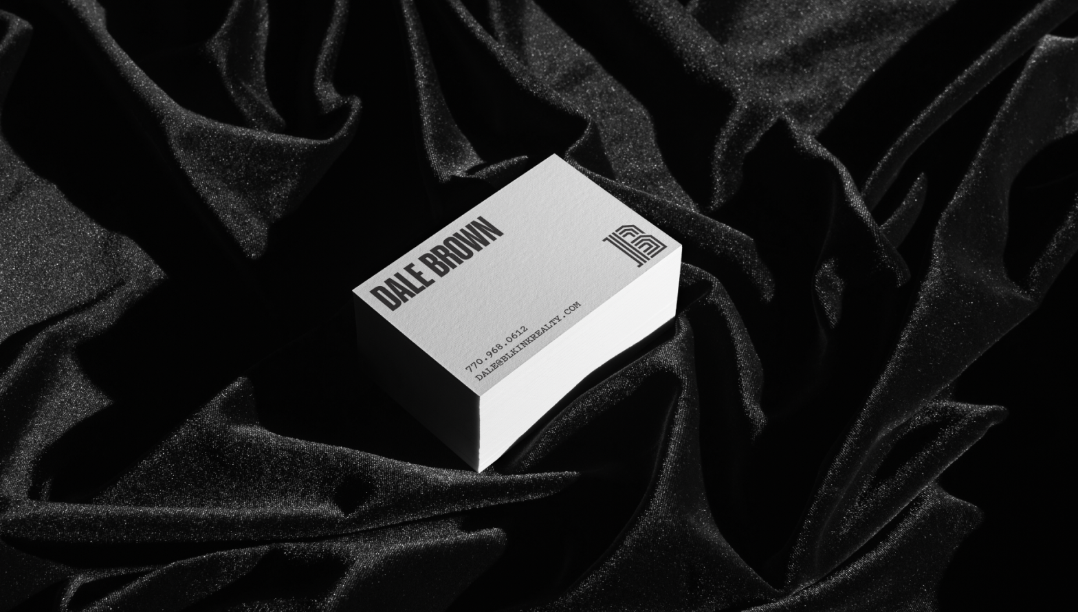
BLK INK Realty is a fresh, bold new face in the Atlanta real estate sector. Founded by Dale Brown and Daryl Boyer, two men who dress in all black and have tattoos down each arm, BLK INK aims to be the real estate company where both the traditional and nontraditional come to purchase the American Dream.
In the early process of designing the logo, we decided that the logo needed to be bold and different from all other real estate brands. Both founders are two of the most unique people one would ever meet, and the brand of their company needs to reflect those characteristics.
To capture a bold aesthetic, we used Neon lights as inspiration for the logo mark. We wanted the logo to stand out from the crowd and pay homage to local neighborhood shop signs, where everybody knows you and you know everybody. From there, we built out the rest of the brand identity to be minimal but bold. We use only two colors – black and white – and the rest of the system reflects a bold new direction for the industry.